Saturday 21 March 2015

Final Piece Plans


For my final piece, I had the idea of merging together two photos, making them one. I decided to use photos of my mum and I and join them together to make one face. As I am looking at the theme of 'different perspectives', I thought that this would show how the two generations are viewed differently, perhaps by using two different mediums, colours or texture on both halves to represent this. 


Here I tried using biro on both halves which I think works because one side is darker than the other, but I would like to show a larger, more obvious contrast between the two. 


On the left I used charcoal and on the right, pencil. I like the strong contrasts in tone however I feel that it does not depict the difference between the two generations. 


Here I used pencil and biro, and I think the biro is a good medium because it shows the sharp, harsh lines which could represent age. However, I think that the left side medium should be in colour to create an even bigger contrast. 


To the left I used oil pastels which I think work well but I feel that there should be a different sort of use of colour and it should be more expressive to show the reckless nature of the youth. 


I tried out using a modern fashion magazine contrasting with a newspaper collage but found it difficult to get a lot of detail into the collage which is what I want in my final piece. 


Here I tried out using expressive watercolour on the left and I feel that this works the best because it reflects the reckless nature of the youth and the biro shows a more reserved nature. On the right I added some watercolours blotches to show that parts of the subject's youth are still there, and likewise with biro on the left. I feel that this represents my interpretation of 'different perspectives' the best and would like to use it for my final piece. 


Artist Experiments


Here I looked at using the sellotape transfer technique, creating blotches of watercolour underneath. I think that the colour underneath the tape works well; to add to this I could create marks in the tape where it is darker with a sponge, so that more colour can come through and the pieces are more expressive. 


Using the same transfer technique, I cut a hole in the page, and painted the other page with colourful watercolours. On the front page I used only black watercolour with different amounts of water to create a contrast of tones. On top of this I stuck down a transfer of my own photo, and underneath this is a photo of the same person taken from a different perspective. I think that the transfers of the faces over the top of each other works well, however I think that the dark watercolour gives the painting a more gloomy atmosphere, which was not intended. Instead I could do the colourful paints on the top page. 


Here I printed out my own photos and, using the same technique as on the transfer techniques, created blotches and drips, this time over the top of the photos. I think that this works well because I like the contrast between the black and white photos and colourful watercolours. Again, this is a technique I would like to use within my own work. 


Here I tried the same idea as earlier but using more colourful watercolours on the top page. I think it works well however the different photos are too dark when out over the top of each other. Instead I could do a biro drawing underneath to create a contrast in textures and to be able to see the page underneath. 

I would like to try out other ways of putting together images looking at faces from different perspectives by taking more photos and experimenting putting them together in different ways. 


Here I took pictures of my mum from many different angles. I cut them up into my different sizes and layed them out in my sketchbook according to which way the face was facing, using a similar style to David Hockey, who has looked at the literal interpretation of different perspectives. I like the fragmented feel this piece is given, and would like to try drawing from something similar to this. 


Here I used photographs of myself, laying them out in a similar style to before, but instead drawing from them in biro. I don't think that this works as well as the photos before as some parts are out of proportion and I feel that the drawing texture is too different from the photos. 


Artist Studies

Gabriel Moreno 


I noticed that a lot of Moreno's works use a biro pen, or a medium similar to this, so I looked at drawing some of his biro drawings. I love the intricacy of his drawings and how much detail is put into them. Above I focused on techniques in the lines such as drawing curved lines in different directions to create a more rough texture, showing movement, as well as softer, straight lines going in the same direction creating a smoother texture, also showing movement. I also used a mixture of more dense lines and lines that are more spread apart to create a contrast in light and dark tones. 


Looking at another one of Moreno's works, I used a mixture of black, red and blue biro, replicating Moreno's use of digital art. I also looked at his use of watercolour in the hair. In this piece, I like the way that the hair shows a flowing movement because of the direction of the lines. I also like the different times that the watercolour is given either by using more or less water. I did find that these studies on Moreno's work took a long time because they are so intricate and detailed. To get the same amount of detail, I will look at drawing the detailed parts closer up, looking at drawing hair, flowers on faces, as well as faces from different perspectives. 


Here I looked at a photo I had taken of a friend, and drew some flowers from life onto her face in a similar style to Moreno's. I like the detail in the flowers as they stand out, however I feel that because the face has quite a light tone to it, it blends in with the background. To improve, I could draw in the darker hair to create a stronger contrast, making the face stand out more. 


Here I was looking at another photo I had taken, showing the movement in her hair. I like the lines and the contrast in tones but I think that I could add more depth to it by looking closely at the way the hair is flowing to get a more realistic outlook. 

Marion Bolognesi


I painted one of Bolognesi's works looking at the colours and techniques that she uses. I noticed that the main colours Bolognesi uses are blue, red, purple, orange and yellow. I also discovered that when using this technique, it is best to wet the page with water before hand, so that when the watercolours are applied the colours spread more. I also like the way Bolognesi draws her faces from different perspectives, and could use this within my own work, as well as looking at a less literal meaning of it. 


Here I used my own photos as a starting point to create my own paintings in the style of Bolognesi. I used similar colours to her, as well as blotching the colours and creating drips of colour. I like how expressive these paintings are and would like to use a similar technique to this within my exam. 


Monday 2 March 2015

Artist Analysis

Gabriel Moreno

Gabriel Moreno is based in Madrid and is well known for his illustrations and advertising. In the past he has created artwork for major companies such as Nike, Coca-Cola, McDonalds and the Rolling Stones. On top of this, Moreno creates his own personal art, making statements about female beauty. His works usually consist of flowing, precise black lines with bright colours being emphasised on clothing, faces and environments. The mediums that are most used by Moreno include pencil, ink, marker, watercolour and digital art. Moreno quotes that his influences include: "women, sensuality and the ability of drawing to multiply that of beyond reality."


"Elena & Rafa"
2011
Gabriel Moreno 

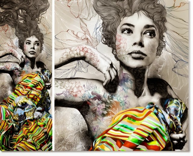
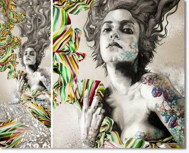
In Moreno's 'Elena & Rafa' we can see very detailed drawings of two women with long, flowing hair drawn with ink, wearing brightly coloured striped clothing and their faces and bodies covered with drawings of objects such as flowers and faces. The main colour in the background and their faces is grey, however this contrasts with the brightly coloured clothing and colourful drawings on their skin. 

The form of this piece is very 3D because of the use of graduating shades creating shapes, and a mixture of dark and light tones creating depth. The lines used in this, particularly in the hair, show movement that is flowing in all sorts of directions. This gives the hair an outlook of a flowing river or stream, as it shows the movement of hair that is interchangeable with water. There are very strong contrasts of tone within these pieces, as there is a range of very light and very dark tones, therefore creating a more 3D effect. The tones are also a mixture of subtly graduated tones, as well as harsh lines of tone. The graduating tone creates a softer effect, creating shapes that are more rounded, whereas the harsher lines of tone create more of a contrasting outlook, making the outcome more dramatic. The fact that only the women are in black and white, and everything else is in colour could suggest that inside they are broken but they use colour to cover it up. The artist has only used primary and secondary colours to contrast with the black and white, highlighting the fact that they are covering up what they feel inside. The use of a lot of soft tones in pencil creates a softer texture, however this contrasts with the use of marker pen in the hair which creates a harsher, more rough texture. 

This work could relate to the work that I would like to make myself because many of the mediums Moreno uses are mediums I like to use myself, for example pencil, biro and watercolour. I also really like the contrast of black and white and bright colours, which is something I would like to include in my own work. I also like the details and the use of realistic drawings mixed with things that are beyond reality. 

Marion Bolognesi

Marion Bolognesi lives in New York, and mixes her work between accessories design as well as her personal passion for watercolour painting. Bolognesi's style consists of very expressive, colourful portraits painted with watercolour. Most of the time she does not paint the whole face, and turns a realistic drawing surrealistic due to her choice of colour. 


2012
Marion Bolognesi 

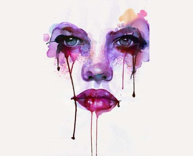
In this painting can see the shapes of eyes, a nose and mouth. Around the eyes are painted blotches of purple, blue and dark red watercolour, the paint dripping down the rest of the face from the eyes and lips. 

The form of this piece is 3D because the tones and shapes make it look as if the face is popping out of the page. The use of line reflects the shapes of the facial features, however there are no definite lines, creating a more realistic outlook because in real life there are no outlines. The use of darker tones around the eyes and the lips create a depth in the drawing, which makes these features stand out the most because they juxtapose against the lighter tones in the white background. In this piece, the artist has used mainly cold colours which are also very dark. The use of dark blues and violets create a moody atmosphere in the painting, perhaps reflecting the subject's sad and depressed mood. This is also shown in the drips of paint coming from the eyes which could represent tears. The texture of this piece is quite soft because of the lack of harsh lines.

This style of work could be used in my own work as I love the different techniques of watercolour used in this, for example the blotching and dripping of colours, showing lots of expression. I also like the way the background is white as it makes the face look like it has come from nothing. I also like the use of the bold and vibrant colours standing out from the plain white background, similar to the lips I saw in the art gallery. I would like to create pieces like this that are have contrast of bold, vibrant colours as well as plain, or black and white. 


Sunday 1 March 2015

AE Contemporary Art Gallery

I had the opportunity to visit the AE Contemporary Art gallery in Warwick, where I was able to see the works of many artists. There were some styles that particularly stuck out to me, which I took photos of for future reference. 


I really like this artist's interpretation of a woodland creature, using the different tones and then using things found in the woods such as leaves, flowers, twigs and fungus on the animal as fur, creating a gorgeous outlook. I could use a similar style to this within my own work using biro, replicating the different tones and shapes. 


I was in awe at the detail of this piece of realistic art drawn with only a pencil. I like the use of light and how it shows a light source coming from one direction, that is not in the drawing, and then creating shadows which contrast strongly with the lighter areas. I would like to use a similar style to this in my own drawings, with a strong contrasts in light and dark as well as lots of detail.


Within this painting as well as the use of bright colours, the artist has shown movement coming from the grass beneath, creating lines that are all going the same direction, showing movement from the wind. I would like to use a similar technique to this by using lines to show movement perhaps in the hair of my portraits or through the use of expressive lines with biro. 


I found a lot of works by Ian Fennely and was fascinated by his paintings of streets and buildings. I love the use of colour as they bring out the brightness and vibrance of the streets. These paintings contrast strongly with the black and white painting, which has more of a gloomy atmosphere, showing deserted streets and grey skies. I would like to use a similar technique with watercolour in my own paintings, such as wetting the page before painting it so that the paints spread and create a blend of bright colours. 


I really liked these paintings of lips as although they are quite simple, with only a white background and one thing as the subject, I found that they are quite effective as the bold red stands out very much from the background, and I found that it was one of the first paintings in the gallery that caught my eye because of it's vibrance. I also love the use of the drips from the lips and would like to use this style in some of my own work but with watercolour as I think it can create quite an effective outlook. 


Observational Drawings

For the AS Level art exam, we were given the task to fill a sketchbook with observational drawings, showing our thinking and development within this. I started off with completing timed drawings of objects:


We had two minutes to draw our objects and I had chosen to draw the rust from a car number plate, however as it is so detailed, I didn't get a lot done on time. Because of this, I decided to change my object to something with a clearer form so that I could make my drawing look more like the object. 


I chose a lantern as it's shape and from is much clearer. I found that this was much easier because I could get a lot more done in the short space of time, making the drawing much bigger and creating more expressive lines. 

I was then given four minutes to draw the same thing, and again found that I could get more expressive lines, this time adding more shading to give it more depth as I had more time to do this.


I did the same thing but drawing the lantern from different perspectives. Giving myself a time limit, and also using different mediums such as charcoal and an eraser. 

After some thinking, I decided that for the theme of 'Different Perspectives', I wanted to look at portraits, looking at faces from various angles. This lead me on to doing some timed drawings of faces of people in my class. 


I used pencil, charcoal and biro, timing myself either two or four minutes to draw the pencil and charcoal drawings, and then having no time limit for the biro drawings. I found that for the timed drawings I like pencil more, because I feel that I have more control with it, as it doesn't smudge as easily as charcoal. I also found that between the two techniques of using biro, I prefer the second one as I found that it was easier to create the expressive lines and that the overall outcome looks better because of the contrast in light and dark. 


To look more closely at the facial features, I decided to do close ups of eyes, noses and lips using pencil and biro. I had no time limit and drew from life, using similar techniques to the ones before, finding that pencil is good for smudging and creating soft tones, however it does not create the same dark tones that are possible with biro. 


Here I used pencil, biro and watered down acrylic paint to create these observational drawings of eyes. I like all of these mediums because they can be used to create different textures and outlooks. For example, pencil can be used for smudging and creates a grainy texture, whereas biro creates harsher lines which can be used for expressive drawings and creating darker tones for depth. Acrylic creates a smoother texture, which is best for the white part of the eye, as well as the iris and pupil because it portrays the smoothness and shininess of it. 


I did the same thing as before but with lips, and used a blue biro, coloured pencils and charcoal. The blue biro creates harsher lines than the coloured pencil and charcoal, but this means that more expressive lines can be used to portray the contrast between light and dark. I found it harder to show this contrast with the charcoal however because it is such a dark medium, I found it hard to add lighter tones to it, even when using a rubber to lighten it, it was difficult to add lots of detail to the drawing as well. I liked using the coloured pencils, however found it hard to find the right colours to use as I had a limited amount of coloured pencils. Despite this I am pleased with the outcome. 


Here I looked at using different techniques with pencil. First using expressive lines with timed drawings, then looking at drawing details over layers of tone with older aged people, then looking at strong contrasts with a 6B pencil and a 2H pencil, as well as a smudging tool. I thought that these smudges could create an even stronger contrast with charcoal, which is what I decided to try next. 


Using charcoal, I looked at first doing timed drawings, then at the two halves of the face that have very different tones. I found that using. Charcoal Is very good for creating strong contrast in tones, however it is vey difficult to get the little details in such as eyelashes and hair, as the charcoal is too thick for the smaller details. 

I then decided to look closer at colour, so chose to use oil pastels to try out different ways of using colour:


I did a timed drawing, and then looked at bringing out different sorts of colours that are a little bit harder to see in real life. For example, I made the blues and oranges stand out more in the drawings of the lips so that it gave the drawing a different outlook that is perhaps less realistic, but makes it look more interesting. I then looked at bringing colour out of black and white, making the eyes stand out more. I also liked the overlapping of the faces and would like to try this out even more with different mediums. 


Using acrylic paints this time, I once again did some timed drawings, then looked at the shapes from the shadows on a crystal glass, drawing the face in the shapes, then I compared the us of colour and black wand white with a acrylic. I found that it was easier for me to paint black and white as I can see the contrast of light and dark better, however with colour it is hard to replicate the right colours and make the paintings look realistic. I decided to try out op using colour with watercolour to see if it was any different. 


As the acrylic, I found it hard to replicate the colours from the photos I was drawing from, and I also found it difficult to get in a lot of detail, particularly in the hair. I did find however that with watercolour I like using black and white, as well as creating tones and blending colours together, so if I do use watercolours in the future, I could use them as a background. I then decided to go back to black and white, using biro, as I found that my black and white drawings and paintings came out stronger. 


Looking at biro, I did a timed drawing, then two observational drawings from photos. I enjoy using expressive lines with biro, as well as including a lot of detail in my drawings. 

I would like to choose an artist that uses either biro, pencil or watercolours, and draws mainly in black and white, as these are my stronger areas.