Gabriel Moreno is based in Madrid and is well known for his illustrations and advertising. In the past he has created artwork for major companies such as Nike, Coca-Cola, McDonalds and the Rolling Stones. On top of this, Moreno creates his own personal art, making statements about female beauty. His works usually consist of flowing, precise black lines with bright colours being emphasised on clothing, faces and environments. The mediums that are most used by Moreno include pencil, ink, marker, watercolour and digital art. Moreno quotes that his influences include: "women, sensuality and the ability of drawing to multiply that of beyond reality."
Gabriel Moreno
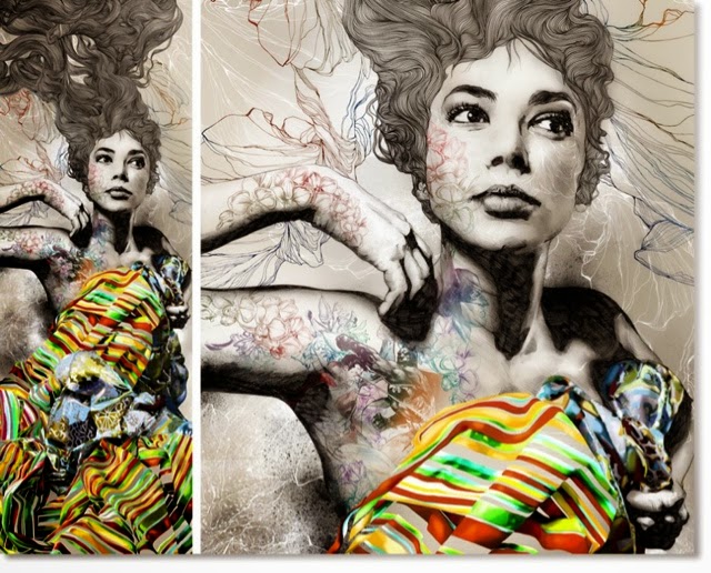
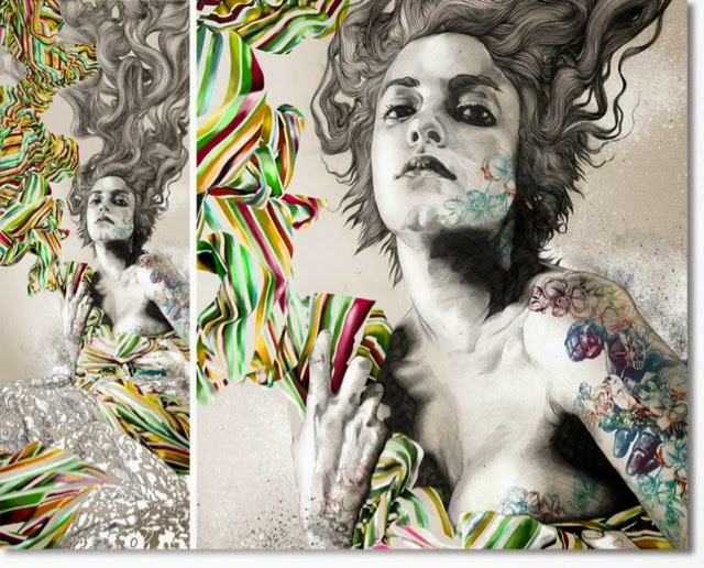
In Moreno's 'Elena & Rafa' we can see very detailed drawings of two women with long, flowing hair drawn with ink, wearing brightly coloured striped clothing and their faces and bodies covered with drawings of objects such as flowers and faces. The main colour in the background and their faces is grey, however this contrasts with the brightly coloured clothing and colourful drawings on their skin.
The form of this piece is very 3D because of the use of graduating shades creating shapes, and a mixture of dark and light tones creating depth. The lines used in this, particularly in the hair, show movement that is flowing in all sorts of directions. This gives the hair an outlook of a flowing river or stream, as it shows the movement of hair that is interchangeable with water. There are very strong contrasts of tone within these pieces, as there is a range of very light and very dark tones, therefore creating a more 3D effect. The tones are also a mixture of subtly graduated tones, as well as harsh lines of tone. The graduating tone creates a softer effect, creating shapes that are more rounded, whereas the harsher lines of tone create more of a contrasting outlook, making the outcome more dramatic. The fact that only the women are in black and white, and everything else is in colour could suggest that inside they are broken but they use colour to cover it up. The artist has only used primary and secondary colours to contrast with the black and white, highlighting the fact that they are covering up what they feel inside. The use of a lot of soft tones in pencil creates a softer texture, however this contrasts with the use of marker pen in the hair which creates a harsher, more rough texture.
This work could relate to the work that I would like to make myself because many of the mediums Moreno uses are mediums I like to use myself, for example pencil, biro and watercolour. I also really like the contrast of black and white and bright colours, which is something I would like to include in my own work. I also like the details and the use of realistic drawings mixed with things that are beyond reality.
Marion Bolognesi
Marion Bolognesi lives in New York, and mixes her work between accessories design as well as her personal passion for watercolour painting. Bolognesi's style consists of very expressive, colourful portraits painted with watercolour. Most of the time she does not paint the whole face, and turns a realistic drawing surrealistic due to her choice of colour.
2012
Marion Bolognesi
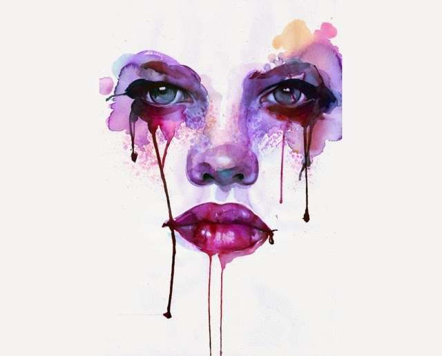
In this painting can see the shapes of eyes, a nose and mouth. Around the eyes are painted blotches of purple, blue and dark red watercolour, the paint dripping down the rest of the face from the eyes and lips.
The form of this piece is 3D because the tones and shapes make it look as if the face is popping out of the page. The use of line reflects the shapes of the facial features, however there are no definite lines, creating a more realistic outlook because in real life there are no outlines. The use of darker tones around the eyes and the lips create a depth in the drawing, which makes these features stand out the most because they juxtapose against the lighter tones in the white background. In this piece, the artist has used mainly cold colours which are also very dark. The use of dark blues and violets create a moody atmosphere in the painting, perhaps reflecting the subject's sad and depressed mood. This is also shown in the drips of paint coming from the eyes which could represent tears. The texture of this piece is quite soft because of the lack of harsh lines.
This style of work could be used in my own work as I love the different techniques of watercolour used in this, for example the blotching and dripping of colours, showing lots of expression. I also like the way the background is white as it makes the face look like it has come from nothing. I also like the use of the bold and vibrant colours standing out from the plain white background, similar to the lips I saw in the art gallery. I would like to create pieces like this that are have contrast of bold, vibrant colours as well as plain, or black and white.


No comments:
Post a Comment