
Here I looked at using the sellotape transfer technique, creating blotches of watercolour underneath. I think that the colour underneath the tape works well; to add to this I could create marks in the tape where it is darker with a sponge, so that more colour can come through and the pieces are more expressive.

Using the same transfer technique, I cut a hole in the page, and painted the other page with colourful watercolours. On the front page I used only black watercolour with different amounts of water to create a contrast of tones. On top of this I stuck down a transfer of my own photo, and underneath this is a photo of the same person taken from a different perspective. I think that the transfers of the faces over the top of each other works well, however I think that the dark watercolour gives the painting a more gloomy atmosphere, which was not intended. Instead I could do the colourful paints on the top page.

Here I printed out my own photos and, using the same technique as on the transfer techniques, created blotches and drips, this time over the top of the photos. I think that this works well because I like the contrast between the black and white photos and colourful watercolours. Again, this is a technique I would like to use within my own work.

Here I tried the same idea as earlier but using more colourful watercolours on the top page. I think it works well however the different photos are too dark when out over the top of each other. Instead I could do a biro drawing underneath to create a contrast in textures and to be able to see the page underneath.
I would like to try out other ways of putting together images looking at faces from different perspectives by taking more photos and experimenting putting them together in different ways.

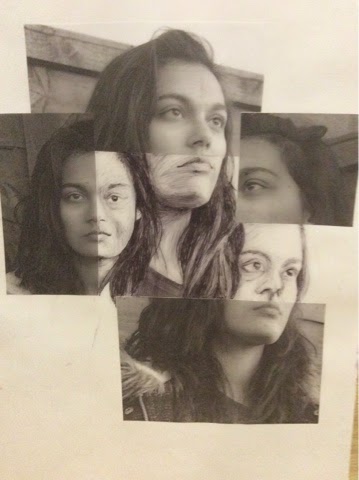
Here I took pictures of my mum from many different angles. I cut them up into my different sizes and layed them out in my sketchbook according to which way the face was facing, using a similar style to David Hockey, who has looked at the literal interpretation of different perspectives. I like the fragmented feel this piece is given, and would like to try drawing from something similar to this.
Here I used photographs of myself, laying them out in a similar style to before, but instead drawing from them in biro. I don't think that this works as well as the photos before as some parts are out of proportion and I feel that the drawing texture is too different from the photos.
No comments:
Post a Comment