
We had two minutes to draw our objects and I had chosen to draw the rust from a car number plate, however as it is so detailed, I didn't get a lot done on time. Because of this, I decided to change my object to something with a clearer form so that I could make my drawing look more like the object.

I chose a lantern as it's shape and from is much clearer. I found that this was much easier because I could get a lot more done in the short space of time, making the drawing much bigger and creating more expressive lines. 
I was then given four minutes to draw the same thing, and again found that I could get more expressive lines, this time adding more shading to give it more depth as I had more time to do this.

I did the same thing but drawing the lantern from different perspectives. Giving myself a time limit, and also using different mediums such as charcoal and an eraser.
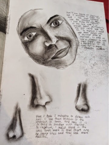
After some thinking, I decided that for the theme of 'Different Perspectives', I wanted to look at portraits, looking at faces from various angles. This lead me on to doing some timed drawings of faces of people in my class.


I used pencil, charcoal and biro, timing myself either two or four minutes to draw the pencil and charcoal drawings, and then having no time limit for the biro drawings. I found that for the timed drawings I like pencil more, because I feel that I have more control with it, as it doesn't smudge as easily as charcoal. I also found that between the two techniques of using biro, I prefer the second one as I found that it was easier to create the expressive lines and that the overall outcome looks better because of the contrast in light and dark.

To look more closely at the facial features, I decided to do close ups of eyes, noses and lips using pencil and biro. I had no time limit and drew from life, using similar techniques to the ones before, finding that pencil is good for smudging and creating soft tones, however it does not create the same dark tones that are possible with biro.

Here I used pencil, biro and watered down acrylic paint to create these observational drawings of eyes. I like all of these mediums because they can be used to create different textures and outlooks. For example, pencil can be used for smudging and creates a grainy texture, whereas biro creates harsher lines which can be used for expressive drawings and creating darker tones for depth. Acrylic creates a smoother texture, which is best for the white part of the eye, as well as the iris and pupil because it portrays the smoothness and shininess of it.

I did the same thing as before but with lips, and used a blue biro, coloured pencils and charcoal. The blue biro creates harsher lines than the coloured pencil and charcoal, but this means that more expressive lines can be used to portray the contrast between light and dark. I found it harder to show this contrast with the charcoal however because it is such a dark medium, I found it hard to add lighter tones to it, even when using a rubber to lighten it, it was difficult to add lots of detail to the drawing as well. I liked using the coloured pencils, however found it hard to find the right colours to use as I had a limited amount of coloured pencils. Despite this I am pleased with the outcome.


Here I looked at using different techniques with pencil. First using expressive lines with timed drawings, then looking at drawing details over layers of tone with older aged people, then looking at strong contrasts with a 6B pencil and a 2H pencil, as well as a smudging tool. I thought that these smudges could create an even stronger contrast with charcoal, which is what I decided to try next.


Using charcoal, I looked at first doing timed drawings, then at the two halves of the face that have very different tones. I found that using. Charcoal Is very good for creating strong contrast in tones, however it is vey difficult to get the little details in such as eyelashes and hair, as the charcoal is too thick for the smaller details.
I then decided to look closer at colour, so chose to use oil pastels to try out different ways of using colour:


I did a timed drawing, and then looked at bringing out different sorts of colours that are a little bit harder to see in real life. For example, I made the blues and oranges stand out more in the drawings of the lips so that it gave the drawing a different outlook that is perhaps less realistic, but makes it look more interesting. I then looked at bringing colour out of black and white, making the eyes stand out more. I also liked the overlapping of the faces and would like to try this out even more with different mediums.


Using acrylic paints this time, I once again did some timed drawings, then looked at the shapes from the shadows on a crystal glass, drawing the face in the shapes, then I compared the us of colour and black wand white with a acrylic. I found that it was easier for me to paint black and white as I can see the contrast of light and dark better, however with colour it is hard to replicate the right colours and make the paintings look realistic. I decided to try out op using colour with watercolour to see if it was any different.


As the acrylic, I found it hard to replicate the colours from the photos I was drawing from, and I also found it difficult to get in a lot of detail, particularly in the hair. I did find however that with watercolour I like using black and white, as well as creating tones and blending colours together, so if I do use watercolours in the future, I could use them as a background. I then decided to go back to black and white, using biro, as I found that my black and white drawings and paintings came out stronger.


Looking at biro, I did a timed drawing, then two observational drawings from photos. I enjoy using expressive lines with biro, as well as including a lot of detail in my drawings.
I would like to choose an artist that uses either biro, pencil or watercolours, and draws mainly in black and white, as these are my stronger areas.
No comments:
Post a Comment