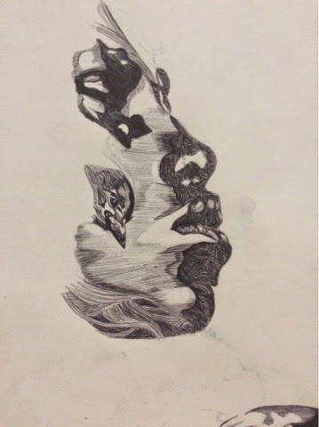

I noticed that a lot of Moreno's works use a biro pen, or a medium similar to this, so I looked at drawing some of his biro drawings. I love the intricacy of his drawings and how much detail is put into them. Above I focused on techniques in the lines such as drawing curved lines in different directions to create a more rough texture, showing movement, as well as softer, straight lines going in the same direction creating a smoother texture, also showing movement. I also used a mixture of more dense lines and lines that are more spread apart to create a contrast in light and dark tones.
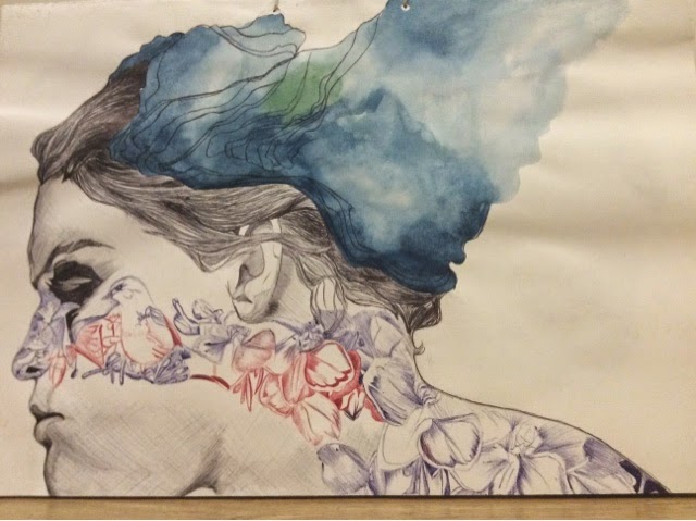
Looking at another one of Moreno's works, I used a mixture of black, red and blue biro, replicating Moreno's use of digital art. I also looked at his use of watercolour in the hair. In this piece, I like the way that the hair shows a flowing movement because of the direction of the lines. I also like the different times that the watercolour is given either by using more or less water. I did find that these studies on Moreno's work took a long time because they are so intricate and detailed. To get the same amount of detail, I will look at drawing the detailed parts closer up, looking at drawing hair, flowers on faces, as well as faces from different perspectives.

Here I looked at a photo I had taken of a friend, and drew some flowers from life onto her face in a similar style to Moreno's. I like the detail in the flowers as they stand out, however I feel that because the face has quite a light tone to it, it blends in with the background. To improve, I could draw in the darker hair to create a stronger contrast, making the face stand out more.

Marion Bolognesi


I painted one of Bolognesi's works looking at the colours and techniques that she uses. I noticed that the main colours Bolognesi uses are blue, red, purple, orange and yellow. I also discovered that when using this technique, it is best to wet the page with water before hand, so that when the watercolours are applied the colours spread more. I also like the way Bolognesi draws her faces from different perspectives, and could use this within my own work, as well as looking at a less literal meaning of it.


No comments:
Post a Comment